
Create individual forms
For creating your own form, you need the extension "CMS extensions". This is part of the Shopware Evolve plan of Shopware 6.
Step 1: Create Shopping Experience
To add your individual form to your Shopping Experience world, click on Contents> Shopping Experience worlds and select the experience world to which the form should be added. Alternatively, you can also create a completely new adventure world / layout.
Step 2: Add form with Drag & Drop
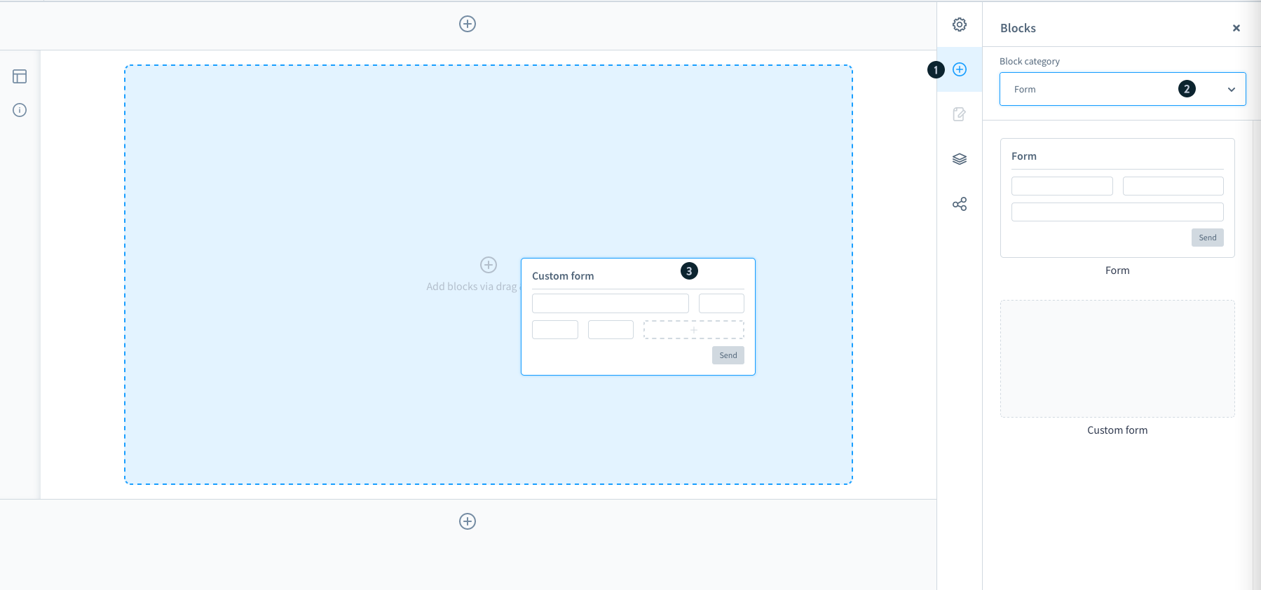
Click on the + symbol (1) on the right-hand side to add a new block. Now select the block category form (2) in the dropdown. In addition to the default form, e.g. for contact, you can now also drag your own form into your world of experience. You can drag and drop the form (3) into the Shopping Experience layout.
Step 3: Create form

A pop-up window opens in which you can choose whether you want to use a template you have previously created or create a new form.
Form settings - Options

When you create a new form or edit an existing form, the form Settings window opens with the options and field tabs. In the options tab you can configure the basic settings for the form.
Name (internal) (1): Enter the internal name of the form. For example, if you save the form in the templates, this name will be used.
Headline (2): The headline is used in the shopping experience, i.e. in the frontend, as the headline for the form.
Confirmation text (3): The confirmation text is displayed to the user as soon as he has filled in the form.
Recipient address (4): Enter all e-mail addresses to which the filled out form should be sent. Multiple addresses can be entered simply by pressing the Enter key once after each address.
E-mail template (5): Select the e-mail template to be used for sending the form content to the recipient addresses.
Step 4: Create fields
In the Fields tab, you can specify which fields can or must be filled out by the user. For this you can create groups, which then contain one or more fields.

Group (1): On the left side you see the groups of the form. You can use the dots on the left to change the order of the groups by drag and drop.
Group context menu (2): On the right side of each group you can rearrange its position, delete it or duplicate it. You can also edit the group so that further options for the group are displayed on the right-hand side of the screen. Here, you can enter the internal name of the group and you can change the heading of the group. The heading is also displayed in the frontend.
Field (3): The fields are located within a group. You can change the order of the fields within the group by drag and drop using the dots on the left.
Field context menu (4): On the right side of the field, you can rearrange its position of the field, move the field to another group, duplicate it or delete it. You can also edit the field there so that further options for the field are displayed on the right side of the screen.
Add field (5): Adds a new field within the respective group.
Add group (6): Use this button to add a new group including a field.
Options (7): Depending on whether you are currently editing a group or a field, you will find further options for the respective group or field on the right-hand side.
If you are editing a group, you will see the information Name (Internal) and Heading. The heading is visible in the frontend, while the internal name serves as an internal identification. E.g. as a variable in e-mail templates.
You can see which options are displayed here when you edit a field.
Save as template (8): With this button you can save the form you have just created as a template. These templates can be edited and selected in your shopping experience.
Done (9): To save all changes in the current form, click on done.
Field options
When you edit fields, you will see the options you can edit on the right hand side. The possible options differ depending on the type of field you are editing. However, the following options are always available for each type.


Name (1): The Internal Name serves as a unique identification for the use of this field as a variable. E.g. in e-mail templates.
Title (2): This name is displayed on the form in the frontend.
Type: (3): Select the type that the field should have. This type determines which values can be entered in the field and how they should look. We have listed the available types below.
Width (4): Here, you define how wide a field should be. If two subsequent fields together use a maximum of 100% of the width, they are displayed next to each other in the form. This is useful, for example, if information is to be entered in two fields, but the content belongs together. E.g. street name and house number.
Required field (5): Indicates whether the field is mandatory or not.
Error message (6): This message is displayed to the user in the frontend if a mandatory has not been filled in.
Text field & email field

For the field type Text or E-mail, you can specify a placeholder text to be displayed if the field has not yet been filled in.
Number field

For fields with the type number, you can optionally specify whether there should be a minimum or maximum limit. You can also specify the steps in which the user can enter numbers. If you enter a 3 here, for example, the user can only select numbers 3, 6, 9, 12, 15, etc....
Selection field

The selection field is a checkbox that the user can activate or deactivate. In the default value you can specify whether the field should already be activated by default or not.
Selection

The selection type offers the user a predefined selection to choose from. Using content = entity, lets you select in the second step, from which shop entity the user can make a selection.
Using content = user-defined, lets you enter values in the second step, from which the user can then choose. Type the values into the field values and press the enter key.
Text area

The text area is used to enter a longer text. In addition to the placeholder text, you can also specify how many lines the user may use and whether the user may change the size of the text area.
Step 5: Assign layout

Storefront view
